Contrast Checker
Color contrast is crucial for readability and accessibility. It helps users, especially those with visual impairments, to distinguish text from its background.
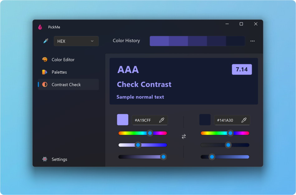
Add the Text and Background Colors by entering the hexadecimal value, dragging a color from the history, picking a color or modifying a color.
If your color contrast is failing, you can fix it manually on the hue, saturation and brightness sliders.
You can create a new palette from the Text and Background colors using the Create Palette button.
Understanding the score:
- Fail: Indicates insufficient contrast between text and background.
- AA Large: The minimum acceptable contrast for text sizes of 18pt and larger.
- AA: The minimum acceptable contrast for text sizes below approximately 18pt.
- AAA: Represents enhanced contrast, with a score of at least 7.0.